
My interest in cycling is bound to the experience of turning on the TV and being drawn to the crazy colours and wild designs of the pro peloton. Compared to other sports that captured my attention at the time, say football or the NBA, superstar athletes like Jordan, Maradona and Magic Johnson wore a single recognisable colour, maybe one logo on the front of their chest. Cycling just didn't add up, yet that is what made it so distinctive. Littered with logos for pasta brands and cement companies, tile sealant sitting side-by-side with regional car dealerships, and the occasional, rare brand actually connected to cycling, the formula was clear. Maximize sponsor exposure. Out of this designer’s nightmare, presented by the challenge of making a jersey with so many competing logos look good, developed a design style and I always saw a certain charm to it all.


Years later, when I looked deeper, the ‘designer’s nightmare’ all started to make sense. As a sport, cycling is more difficult to monetise primarily because the races are moving over long distances throughout the country side. When you can’t sell tickets to your stadium or the advertising space inside it, and your team doesn’t even have a fixed name, home city, or set of colours that stay consistent from one season to the next, how do you actually keep the lights on? You sell the only advertising space you have, the space on your jersey.


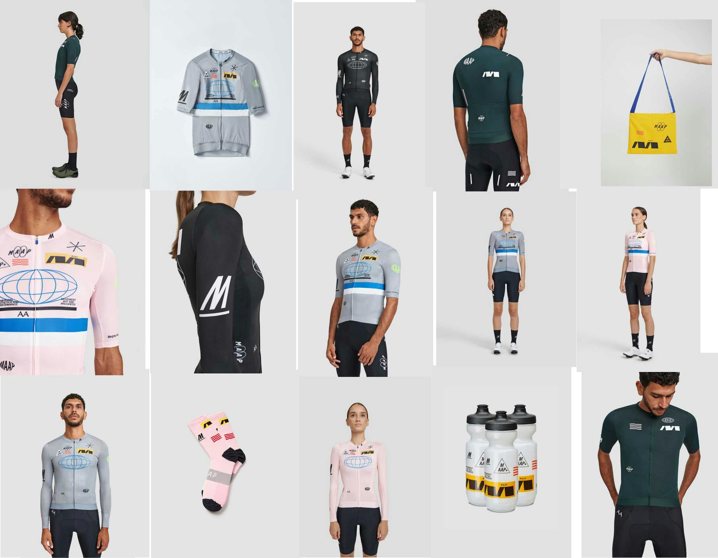
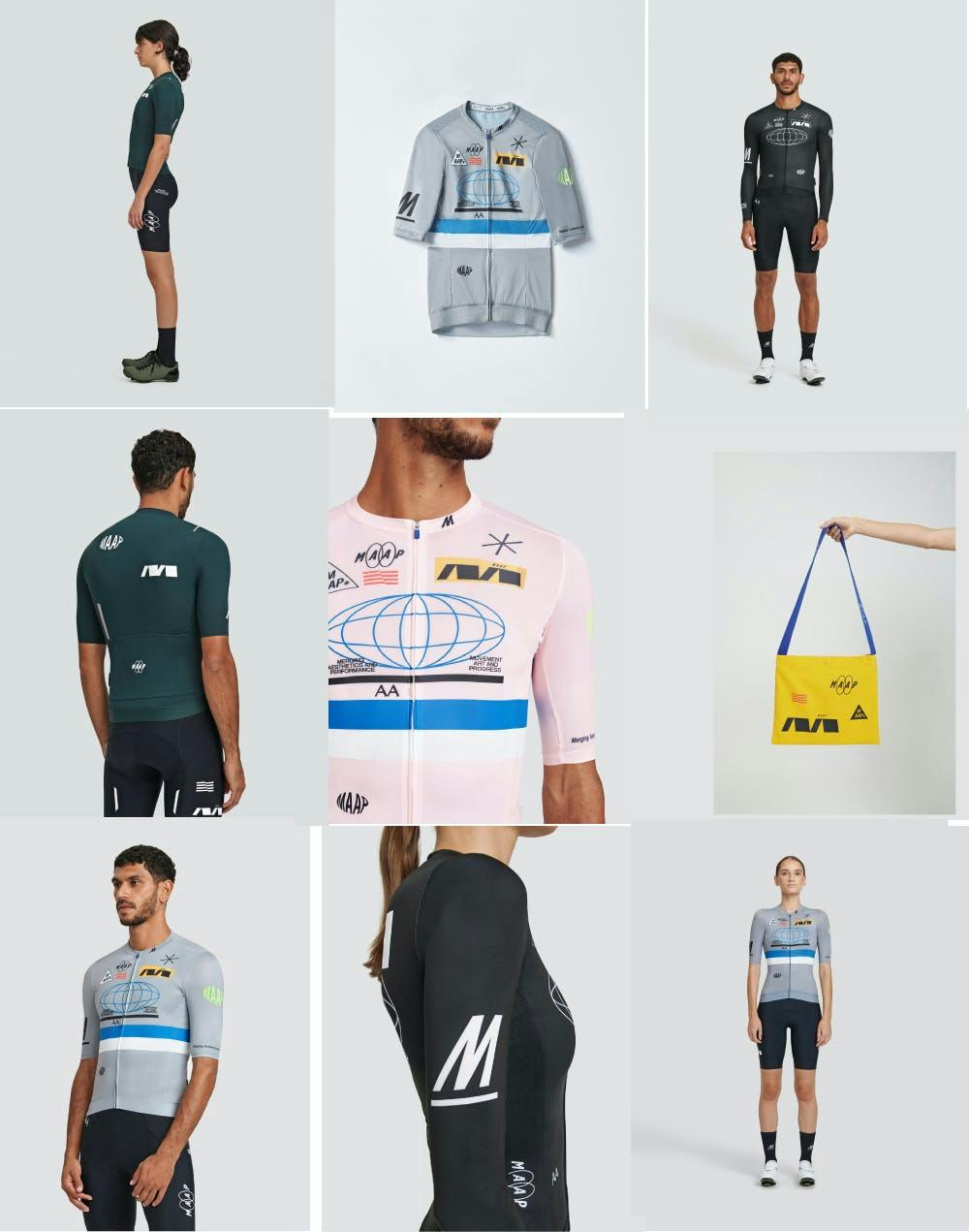
Outside of MAAP HQ, we don't often talk about the design inspiration behind our collections. Our aim has always been to present MAAP as technical apparel. Focussed on the technical features and performance attributes of the garments. However this Axis collection feels different. The first in a new design direction we are introducing over the next few months and maybe something that lends itself to some discussion.


Honestly, the initial idea for Axis was somewhat accidental. The result of a whole page of half-baked design ideas, none of which were good enough to make it into a collection. But as I grouped the draft designs onto the one jersey it started to suddenly feel progressive and nostalgic, drawing reference from cycling team kits of the 1980s and 90s and blending it with a more contemporary design aesthetic.


In 2014, the original MAAP Team Jersey design had a similar origin story. After developing the initial branding directions for MAAP, and selecting the final one, we were left with a page of alternate ideas which I didn’t want to bin, so I stacked them up on a single jersey. It was an ironic comment on the over the top branding on pro-tour team kits, and a reflection on the original inspiration for MAAP. Instead of an assortment of brands that I felt no connection to and was not sponsored by, we were backing ourselves and subverting what was there before to make something new.


My references to the pro peloton in the years to come were more subtle. We never went back to the logo mashup. By removing or abstracting the branding and typographic elements on a jersey I was left with abstract shapes and colours which for the next 5 years were the dominant style of a MAAP jersey.
Who knows what the next 5 will hold…


